Foreword:
Hey guys, we’re back to our regularly scheduled programming (blog schedule) as we formally close our crowdfunding round. While the outcome was unfortunate (see our closing remarks here: https://www.kickstarter.com/projects/criticalforge/forged-of-blood/posts/1877218 ) we are excited to go back to our (more or less) regular production schedule as the team is no longer stretched out in trying to chase down PR leads and maintaining the campaign. To everyone who keeps up with us here and on the communities we are always open to your comments and suggestions so please do continue to engage us. To start us off with a bang, Ken’s here to talk about our most recent overhauls to Forged of Blood:
The UI Overhaul
Hello readers, this is Ken writing, and I am back with a post covering our UI (User Interface) and more specifically UX (or User Experience), and their evolution. For this blog, I will focus on the Tactical Layer specifically.
Rethinking Our Tactical Layer
While our first run at the UI design worked well from the art standpoint (Igor and I are very happy with the minimalist fantasy thing we have going on), our trips to Gameprime Asia 2016 and PAX East 2017 gave us a lot of to reflect on. During the events, we had players play our Tactical Layer gameplay. Although there were a lot of gameplay improvements from Gameprime to PAX, the UI and UX remained consistent throughout, so feedback and criticism about the UI were taken very seriously by us. One of the most jarring UI issues we saw was that players kept trying to hit enemies behind cover using low-level Maul attacks – with a 0% Hit Chance. This concerned us as this meant that the displayed tactical information was not conveyed well to the players.
In the old Tactical UI, when a player had to make a decision to attack an enemy, their eyes needed to shift to the bottom left area to check their attack’s Hit Chance. While if you need to check the status of the enemy you had selected, you had to look towards the bottom right area. This huge space gap of space between the displayed information was very unintuitive as players will tend to be oblivious about the information presented.
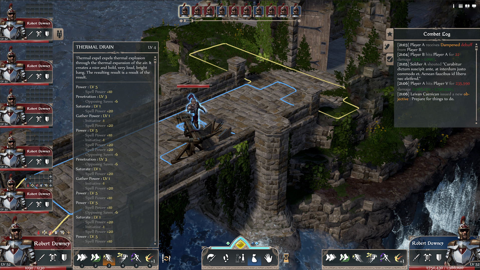
1a. First UI Pass, Concept
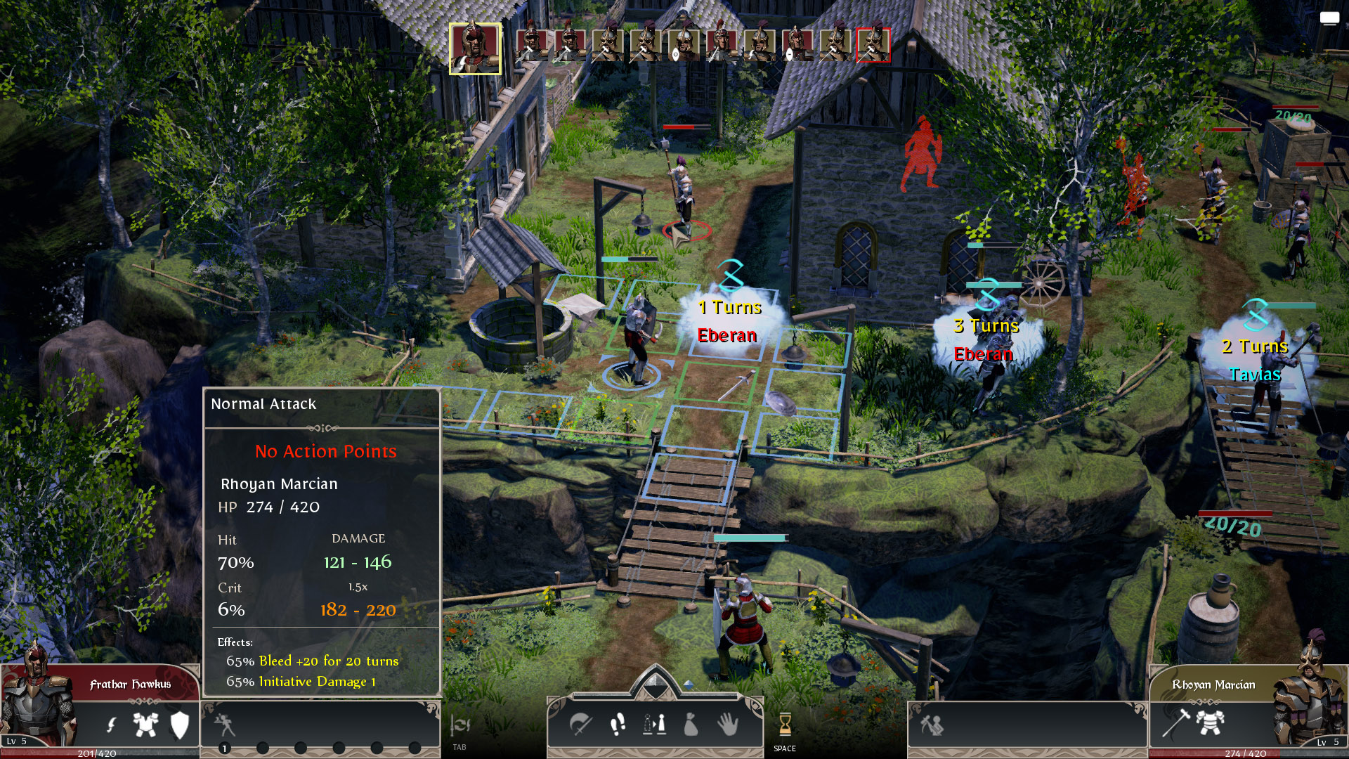
1b. First UI Pass, In-game
As we were examining the previous Tactical UI, we also felt that some elements were not doing much and only added to the screen clutter. If you look at the above screenshots, what we called the Action Center (the panel at the bottom center), contained icons that were not used often by the players and were there mostly for redundancy – we had buttons to Attack, Move, Shift, Use Item, Interact. Fathur (our programmer) brought a great point that the center area of the screen should be used for very important actions and information, and with the previous implementation, the most important aspects, such as Abilities and attack Hit Chance, were located to the side.
Although we liked how the Action Points were conveyed (the bar and node designs above the icons), it was not easily expandable and that’s became a problem. Due to iterations in the game design, units are now able to have up to two digits of Action Points, and with the old UI, it’s almost impossible to expand the number of points displayed.
What’s interesting to see in our iterative design process is how our design philosophies shift with feedback and experience. Going into our first UI pass, the philosophy was to present the player as much information as possible to allow for a deliberate action. This led to the cluttered mass of information that our players experienced, and through feedback, we quickly shifted our design direction to one that tiers the information presented. Before we tackle the UI changes, we first had to revisit all the relevant tactical information and properly categorize them in order of importance. Which naturally led us to revisit the user experience as a whole.
Rethinking Our UX
Our conversation started by discussing the feedback we have gotten from our players. Coming into the UX challenge, we first had to redefine the goals for the Tactical Combat. We listed the information and actions that the players needed to be take to achieve those goals. After establishing an order of importance for each action and presented information with the game designers, we also had to look at the primary, secondary, and tertiary placement of information and how it is all ultimately accessed by the player. Several of the team members, namely Pandu, Fathur, and myself went on to do some research about how tactical information was laid out in other games.
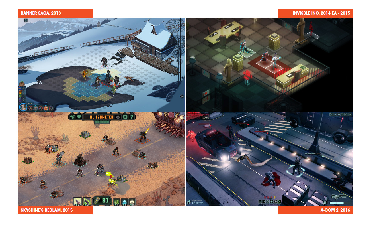
2. UI Research
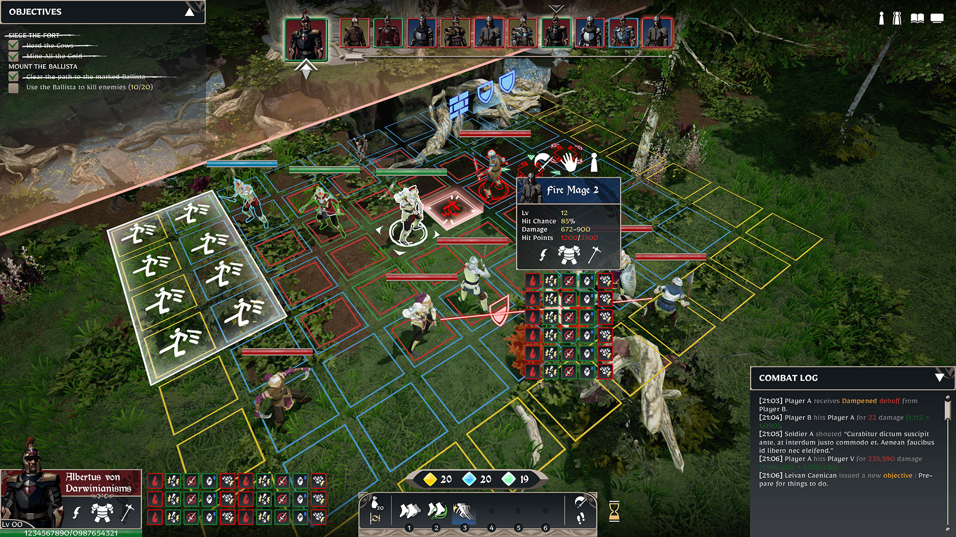
The decision was made to streamline player interaction and information overlay to the mouse cursor. Information that we had relegated to the lower tiers of importance will now be accessible through additional steps, while all actions and top-tier information are available immediately in the primary Tactical Layer.
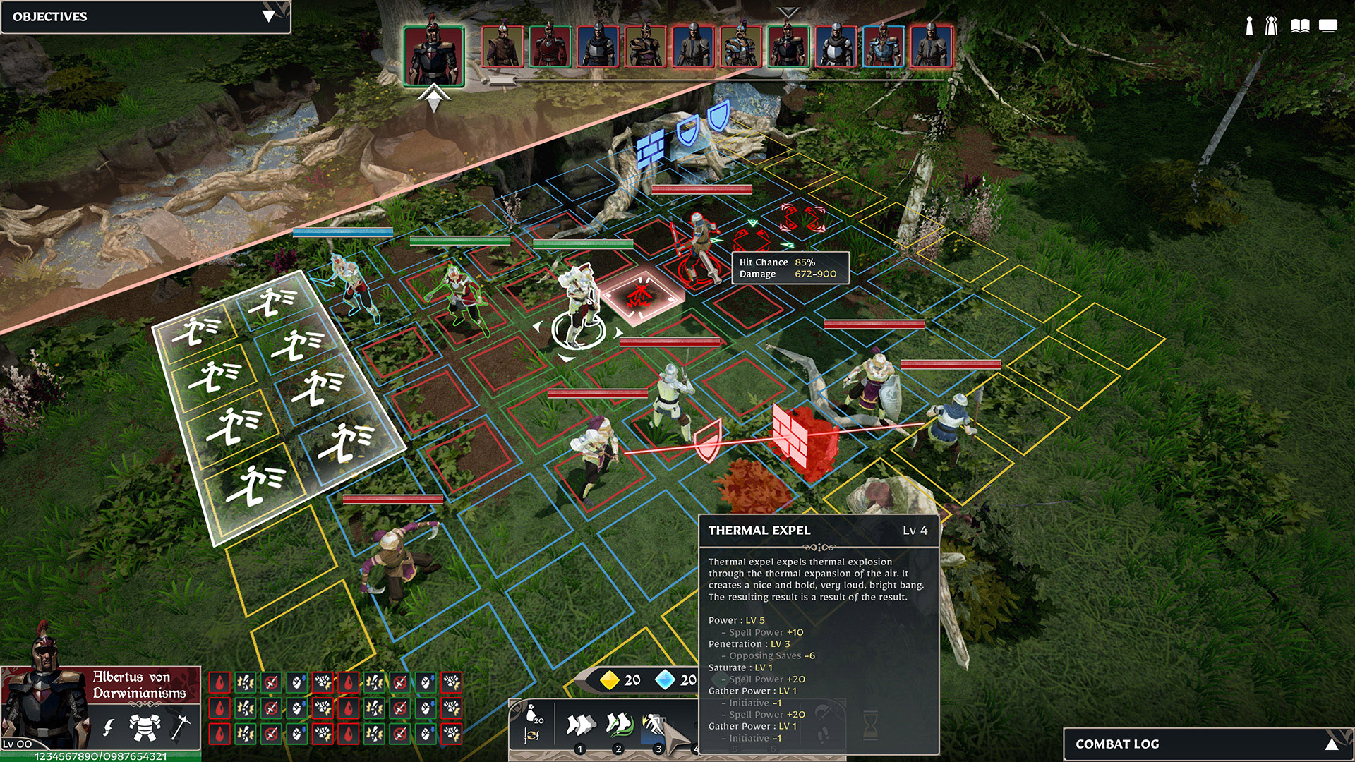
3a. New UI Concept, unexpanded
3b. New UI Concept, Expanded
So in the new UI flow, we changed how the Left and Right Clicks work. Left Clicks are now actions, and Right Click is used to access more detailed information and actions. Streamlining the new tactical UX as such:
- Top Tier Information (Image 3a):
- Turn order (top center)
- Player Character information (bottom left)
- Accessible Player Actions (bottom center)
- Base Tactical Actions, Player Character Abilities
- Gameplay information (top left and bottom right)
- Quest information, Actions taken
- Action Information (on mouse cursor)
- Ability Descriptions, Hit Chance on Target, Action Tooltips
- Secondary Tier Information (Image 3b):
- NPC Information & Available Actions (on mouse cursor, on right-click on target)
- Expanded Character Information Sheet (windowed overlay, on left-click Character button)
- Expanded Lore Information Sheet (windowed overlay, on left-click Codex button & demarcated hyperlink)
- Game Menu (windowed overlay, on left-click Game Menu button)
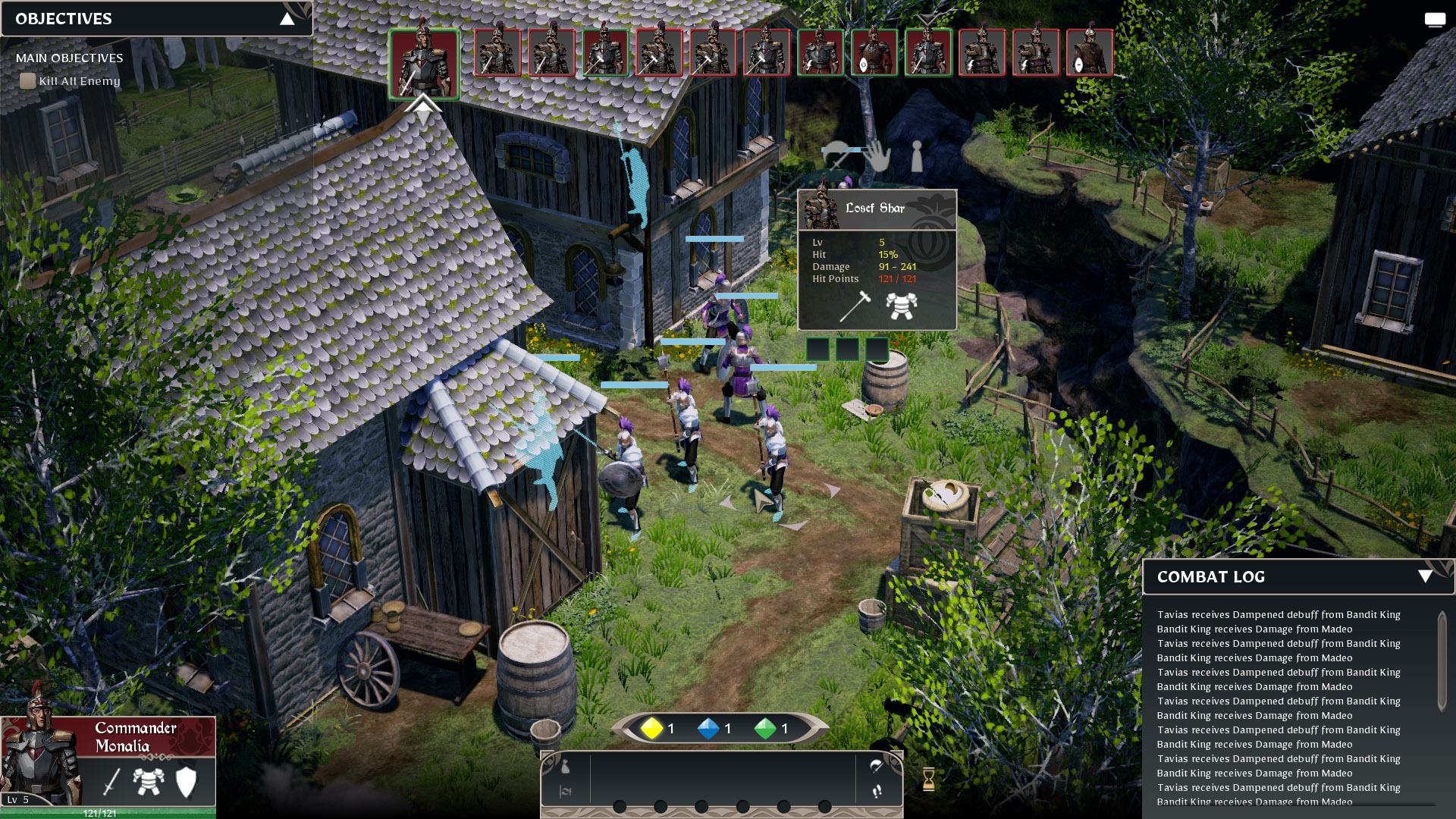
As you can see, the Action Center is now merged with the Ability Bar in the center, with the current character’s abilities as the focus. We feel that this is more important than showing just the actions and relegating the abilities to the side. The move actions are also streamlined: all move actions are now just called Move in the Action Center (located at the bottom right). The previous actions are now located to the sides while the End Turn button is unchanged. Action Points Panel has also replaced the old design, it now clearly displays (in numbers) how many points the unit has. We have also made Objectives and Combat Log to be more easily accessible to the player by moving them to the top left and bottom corners of the screen respectively.
You will also notice that the Turn Order is now bigger and more prominent on the screen – clearly showing what armor the units are wearing and whose turn it is and where the unit’s next turn will be. The frames of the units also reflect the allegiance of each unit in the tactical layer: red being enemies, green being controllable units, and blue NPC allies. The color information is also reflected in the floating health bar above the units.
Here’s a WIP of how it looks in-game. Note that not all of the changes have been implemented yet.
4. New Tactical UI Work-in-Progress
Additional UX Quality of Life Changes
There are a few other additional features/changes we have decided upon that affects players’ User Experience. One such issue that we addressed is helping players distinguish what’s a cover object and what’s not, we had to identify the problems and define some guidelines for the artists to follow. Before PAX, there were no rules about covers, so any object of any size could either be a Partial Cover, a Full Cover, or a Complete Cover, as long as they feel like it’s suitable. It’s very arbitrary and subjective, and ultimately, confusing to the player. This was especially apparent in more natural maps. Distinguishing between traversable path and covers was like a guessing game.
So to solve this issue, we now have defined rules for each type of cover. Partial Covers can now not go over 1 block high is one of such rules. There are definitely more to the cover changes, but basically the rules are now helping the players identify the visual information better.
That is all for this week’s blog post about our tactical UI and UX updates. Thank you for reading, I hope it was an enjoyable read from start to finish. See you again next time.
– Ken

Leave A Comment