We’ve got a quick follow up to Ken’s post on the UI updates and the visual changes we’ve made to our cover system. While last week’s post covered most of the biggest updates we’ve made to the UI, we thought it would be nice to give a quick look at the “quality of life” changes Ken mentioned in how we’re visually treating the full and partial covers on the tactical map.
We’ll start off by showing the forest map (full gameplay video of the map) we showed at PAX which we actually really loved because of the dense foliage and the arrangement of Cover Objects on the map that created natural choke-points and engagement zones. The introduction of magic to our build also allowed players to open up new avenues of attack which was an absolute blast. However, with all the cover objects being trees of some sort – even with our new UI updates and the overlaid “cover markers” – it was still very hard to distinguish what was Full and Partial cover as well as figuring out which parts of the map were indestructible map blockers. That’s where our new guidelines came into play.
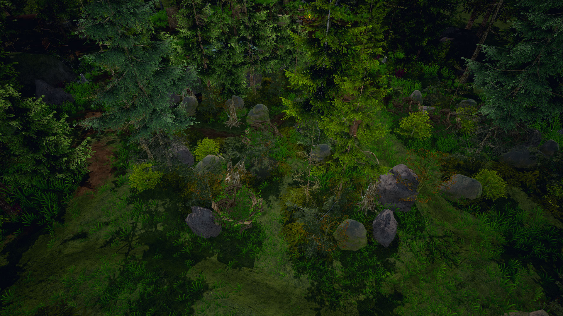
Bandit Camp (forest environment), version 1.
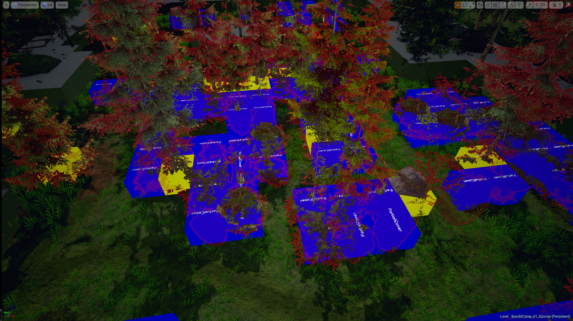
Bandit Camp (forest environment), version 1 with Cover Object Markers shown.
The first thing we set was height restrictions for objects that will count as Partial Cover, and introduced density restrictions for objects we’d count as Full Cover. Without going too much into the long discussions we had, our final guidelines are basically:
- Partial Covers should not be greater than the height of a humanoid character and should encompass a good portion of a cube to be able to provide cover from all four sides.
- Full Covers should be greater than the height of a humanoid character, be dense enough to provide cover from all four sides, but be porous enough that targets can still be hit.
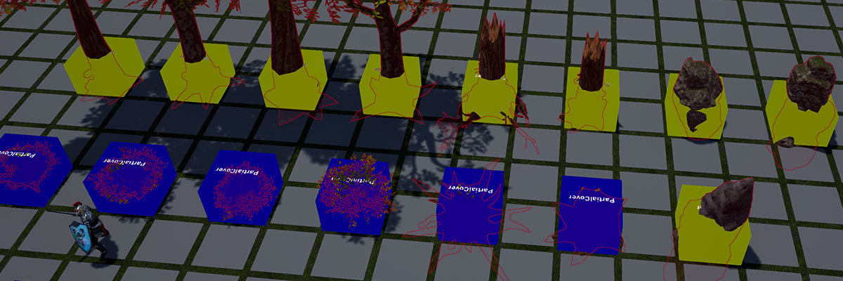
We had a few more rules than that, but those were the big two. Below are the objects that we resized and shaped for the different Cover Objects in relation to a character. You’ll see the new cover objects and how they fit which cubic tile below:
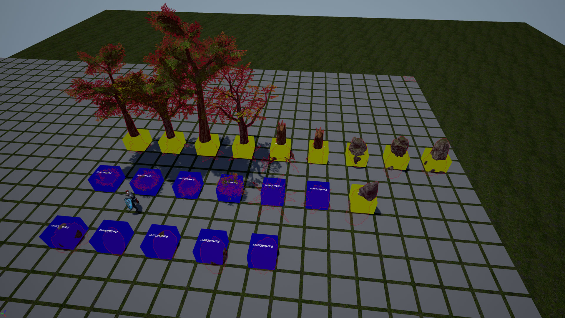
New Cover Objects (plains and forests) with Cover Object Markers shown.
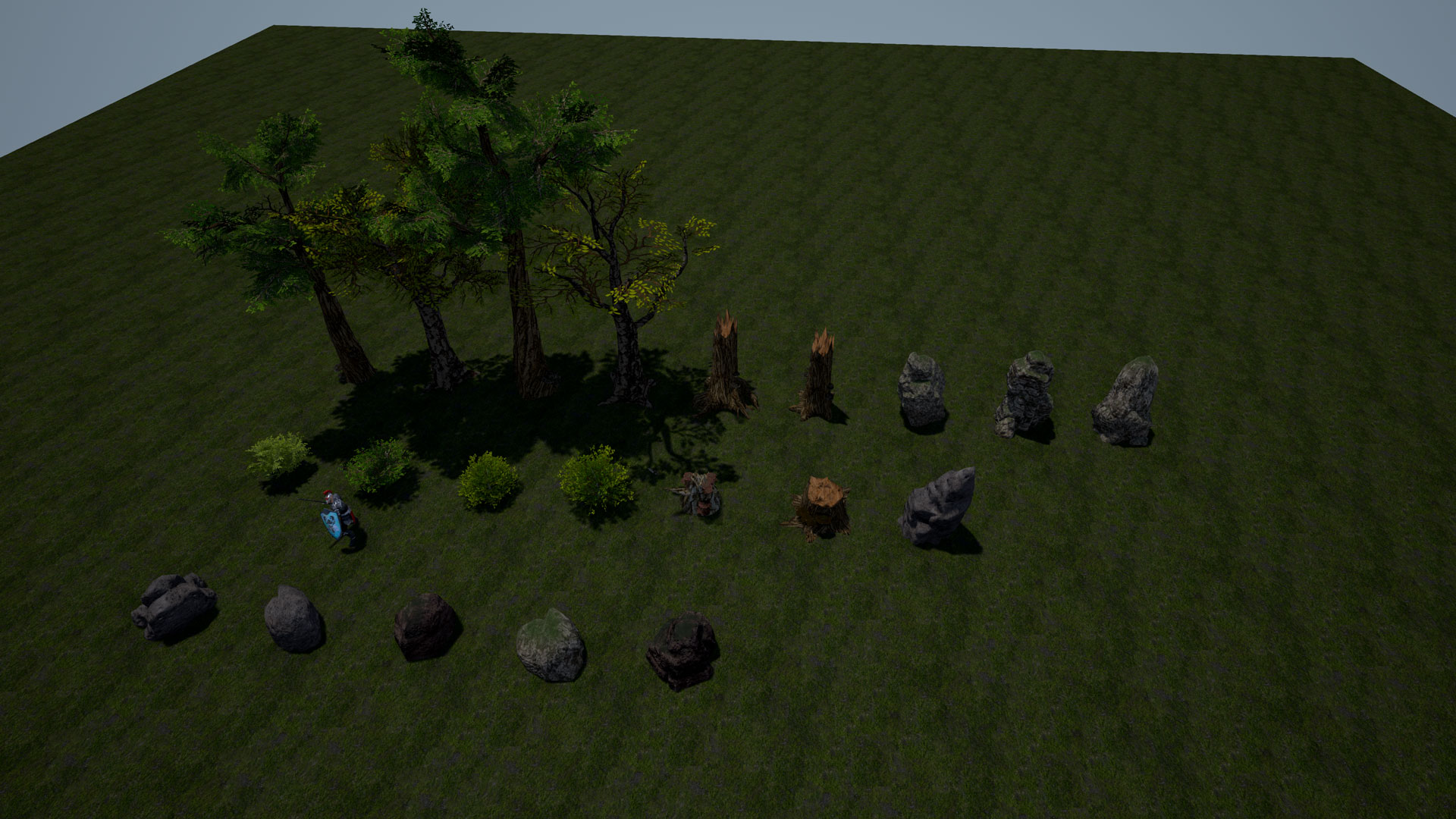
New Cover Objects (plains and forests).
With proper guidelines set for Cover Objects, we still had the issue of the indestructible trees that were placed as Map Blockers. From a map design perspective, these indestructible Map Blockers were used to control the flow of the map and create different tactical opportunities in the terrain. The main issue with using trees in a heavily forested map means that it makes it difficult for the player to know which trees are Cover Objects and which trees are blockers. After weighing the pros and cons of drastically changing the feel of the map, we decided that player understanding of the terrain takes priority over ease of map design for us. We ultimately made a blanket rule that Map Blockers now need to be part of the terrain (as in rock formations, hills, solid buildings, or rivers and lakes) and cannot compete with Cover Objects when placed within the boundaries of the Tactical Combat Map.
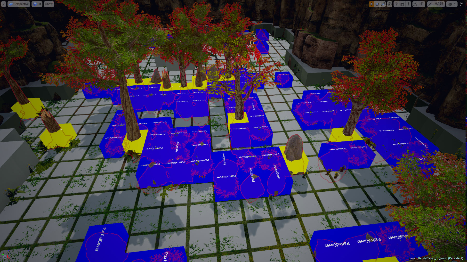
Bandit Camp (forest environment), version 2 with Cover Object Markers shown.
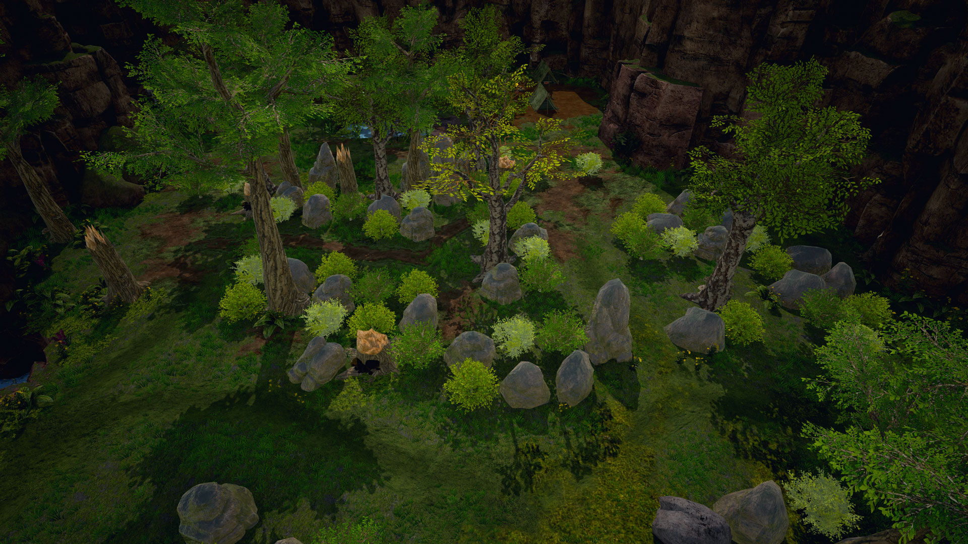
Bandit Camp (forest environment), version 2.
The result, as you might see, is drastic – both from a visual and a tactical standpoint – but we think it’s for the best as it does allow the player to survey the field a bit more. Setting these rule-sets for the game for us is one of those “obvious now that we did it” sort of things – and also one of the truest reflections of the hurried production schedule we face as a small indie studio.
Forged of Blood is our first run at game development as our own studio, and try as you might to account for every rule and guideline, there is something to be said for human fallibility and inexperience. More often than not, things have to be pushed back and pipeline urgencies and sensibilities only emerge when an issue is too big to ignore. We are at ultimately very lucky to have a team that is able to see these issues, discuss them, and make a change (without too much yelling).
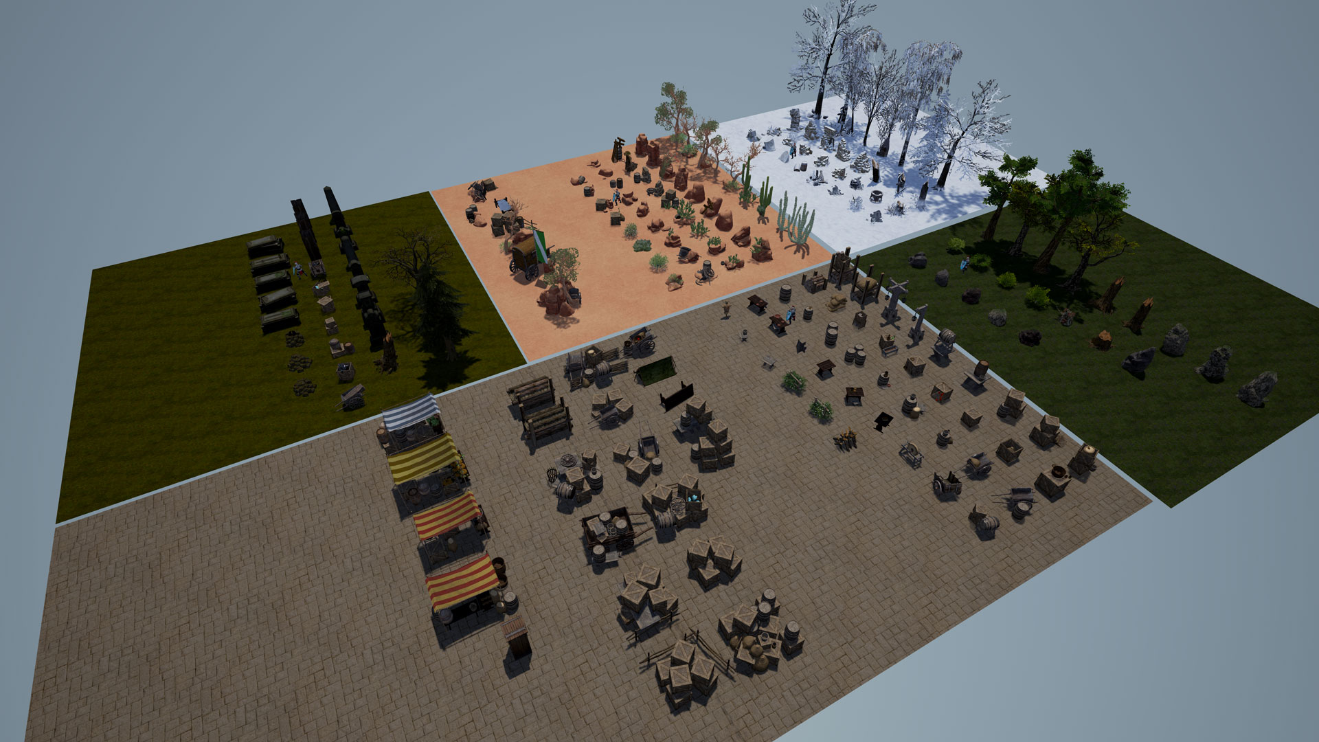
Updated Cover Objects across multiple environments.
Lienny and Jenny have spent the last few weeks going through each of our environments and updating the Cover Objects to our guidelines, as well as assembling a set of objects that can be used in each environmental tileset. Ken also had his hands full tackling how these new rules will affect a lot of the fully custom architectural assets needs to be handled (more on some the gorgeous work he and the art team have have done later). Anyway, I’ll leave off here with a look at the Cover Objects the girls have created so far, and we’ll cover each environment a later date.
With our tactical map production pipeline now moving at a solid pace, our next big challenge is finalizing the rest of the game. For now, here’s a little look at what we’ve been working on as well: laying out the basic UX flow for our Strategic and Castle layers (we’ll have an post on that soon!).

Cheers everyone, until next time.
Igor

Leave A Comment